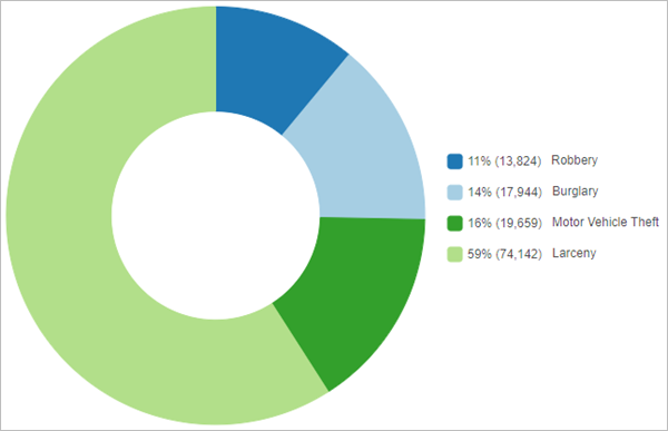
Pie charts group data into slices to visualize part-to-whole relationships. The chart represents the total (either count or sum) of all categories, and each slice is the proportion of a single category compared to the whole. Visualizing data as proportions helps you to understand the magnitudes of each category relative to each other and to the total.
Example
Create a pie chart to visualize the proportions of crime types for incidents within a city.
- Category—Crime type
- Aggregation—Count
- Numeric field—None
- Display—Both (value and percentage)

Data
The Data configurations include the variables that are used to create the pie chart.
Slices from category
Pie charts are created using a single category field by default. Pie charts display unique category values from the Category parameter as slices. The Category parameter must be a string or integer.
The size of the slices correspond to the proportion of each category to the whole. An Aggregation method must be chosen to specify how the proportions are calculated. By default, the chart uses the Count aggregation method, which totals the number of times each unique category appears in the category field and uses the totals to calculate a proportion for each slice. A numeric field can also be chosen to calculate the proportions of the categories. If a numeric field is used, the aggregation method is changed to Sum, meaning the sum of each unique value is calculated using the numeric field and the sums are used to calculate a proportion for each slice.
Slices from fields
Slices can be created using multiple numeric fields by choosing Fields for the Slices from parameter. You can add numeric fields using the Select numeric fields button. The pie chart displays each of the chosen fields as an individual slice using the sum of the field to calculate the proportions for each slice.
Labels
You can turn on labels that display the value of each slice by enabling Show data labels.
Sort order
Pie charts are automatically sorted counter-clockwise by value. The sorting can be changed using the Sort order parameter. The following sort options are available for pie charts:
- Label clockwise—Categories are arranged alphabetically in clockwise order, starting at the top center of the chart.
- Label counter-clockwise—Categories are arranged alphabetically in counter-clockwise order, starting at the top center of the chart.
- Value clockwise—Categories are arranged by value in clockwise order, starting at the top center of the chart.
- Value counter-clockwise—Categories are arranged by value in counter-clockwise order, starting at the top center of the chart.
Slices
The Slices configurations determine how the slices on the pie chart are displayed, including the grouping, labels, and slice colors.
Settings
You can change the size of the donut hole using the Donut size parameter. The default donut size is 50. You can increase or decrease the Donut size value to increase or decrease the size of the hole.
You can change the threshold for creating individual slices using the Grouping (%) parameter. The default grouping percent is 0, meaning all categories or fields are shown as separate slices on the chart. Increasing the grouping percent will group all slices below the threshold into a single Other category.
Labels
You can change the character limit and number of decimal places in the label. You can also choose whether the labels show the value of each slice (count or sum), the percentage, or both the value and percentage. The label settings apply to the legend, data labels, and hover pop-ups.
Slices
The categories displayed on the pie chart are listed under Slices. You can change the color or label for a slice by clicking the symbol color patch in the Slices list and choosing a new color or typing a new label.
Grouped slices
The categories displayed in the Other slice on the pie chart are listed under Grouped slices.
Format
You can configure the look of the chart by formatting text and symbol elements. Chart formatting options include the following:
- Text elements—Size, color, and style of the font used for the chart title, legend title, description text, legend text, and data labels. You can change the format for multiple elements at once by pressing Ctrl and clicking to select the elements.
- Symbol elements—The background color of the chart.
General
The default titles for charts are based on the variable names and chart type. You can edit or turn off the titles on the General tab. You can also provide a title in the Legend title parameter and a chart description in the Description parameter. A description is a block of text that appears at the bottom of the chart window. The Legend alignment can be set as Right, Left, Top, or Bottom.
Resources
Use the following resources to learn more about charts:
- Configure charts
- Configure pop-ups to add charts